Subtotal ¥0.00
Master sourcing color coded wristbands with expert tips on accurate color matching Pantone use material impact and QC for flawless bulk orders
Have you ever faced the nightmare of unboxing a bulk order, only to find the colors are completely off?
It’s a procurement manager’s worst fear: the “Corporate Red” you approved on a screen arrives as “Burnt Orange” in the box.
When it comes to Sourcing Color-Coded Wristbands, precision isn’t just a preference—it’s a strict requirement for brand identity and safety compliance.
In this guide, you’re going to learn the exact technical steps to ensure Accurate Color Matching every single time.
We will move beyond basic RGB values and show you how to leverage the Pantone Matching System (PMS) and navigate material physics to guarantee your physical product matches your digital design.
Ready to eliminate the risk from your next order?
Let’s dive in.
The Technical Barrier: Screen vs. Product Color
Have you ever opened a shipment of “Navy Blue” wristbands only to find they look more like “Royal Purple”? It is the most common headache we see in procurement. This usually isn’t a manufacturing error; it is a translation error between light and pigment. When sourcing color-coded wristbands, understanding the language of color is the first step to getting exactly what you ordered.
CMYK vs RGB for Manufacturing: The Breakdown
Your computer screen and our production machines speak different languages. A digital proof is just a simulation. Here is why a screenshot rarely matches the final physical product:
| Color Mode | Used For | How It Works | Manufacturing Reality |
|---|---|---|---|
| RGB | Screens (Phones, Monitors) | Created by combining Red, Green, and Blue light. | Do Not Use. Colors appear neon and backlit, which cannot be replicated with ink or silicone. |
| CMYK | Paper Printing | Created by layering Cyan, Magenta, Yellow, and Black dots. | Avoid. Good for flyers, but inconsistent for solid-color merchandise like wristbands. |
| PMS | Manufacturing | Pantone Matching System. Uses specific ink mixing formulas. | The Standard. The only way to guarantee the exact shade across different batches. |
The Monitor Variable
Never trust an uncalibrated screen for final approval. Monitors emit light, making colors appear significantly brighter and more saturated than physical materials ever can. Furthermore, every screen is different—what looks like “Forest Green” on your smartphone might look like “Kelly Green” on your office monitor. Relying on visual approximation from a digital file is a gamble we do not recommend taking.
Actionable Advice: Stick to PMS Solid Coated
To eliminate the guesswork, we strongly advise using Pantone Matching System (PMS) Solid Coated codes. Unlike Hex codes (which are for web design) or CMYK (which varies by printer calibration), a PMS code is a universal recipe.
- Ignore Hex Codes: These represent pixels, not pigment.
- Specify PMS “C” (Coated): For silicone and glossy plastics, the “Coated” chart provides the most accurate reference.
- Reference a Physical Book: If precision is critical for your brand, verify the color in a physical Pantone book rather than viewing the code on a screen.
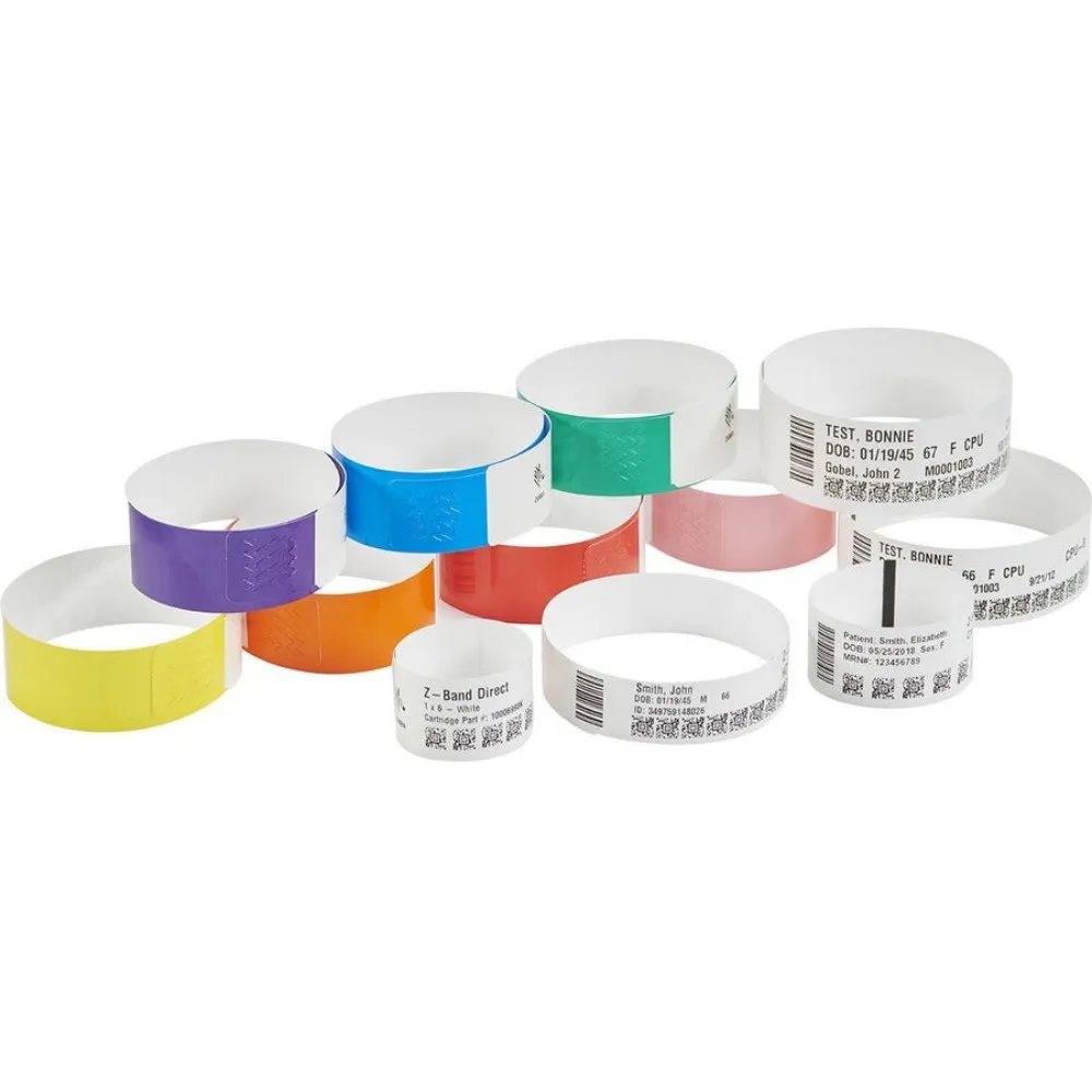
Material Physics: How Base Materials Alter Color Perception
When sourcing color-coded wristbands, understanding that the base material dictates the final color output is crucial. You cannot expect ink on a fibrous paper band to look identical to dye on a shiny piece of plastic. The physics of light absorption and reflection varies across substrates, directly impacting how the human eye perceives the Pantone Matching System (PMS) code you selected.
Silicone: Matte vs. Glossy Finishes
In custom silicone wristband manufacturing, the surface finish changes the game. A matte finish absorbs light, making colors appear deeper and more “true” to the swatch book. Conversely, a glossy or oil-sprayed finish reflects light. This reflection often tricks the eye into seeing the color as brighter or slightly lighter than intended.
Tyvek and Paper: Ink Absorption
Tyvek wristband printing involves porous, fibrous materials. Unlike plastic, Tyvek and paper soak up the ink. This absorption can lead to lower saturation levels or a slightly darker appearance compared to a backlit screen. The texture breaks up the light, meaning neon colors might pop less on paper than they do on smooth vinyl.
Fabric: Woven vs. Sublimated
Fabric wristbands present two distinct realities for color matching:
- Woven Wristbands: We are limited to pre-dyed thread stock. We select the thread closest to your PMS code, but it is an approximation, not a custom mix.
- Sublimated Wristbands: We print dye directly onto a white polyester base. This allows for exact screen printing color accuracy and precise PMS matching, as we control the ink formula.
PVC and Vinyl: Transparency Factors
With vinyl, the opacity level is the main variable. Solid vinyl holds color well. However, translucent or clear vinyl dilutes the color vibrancy because it allows light (and skin tone) to show through.
Material Impact on Color Accuracy
| Material Type | Color Behavior | Best For |
|---|---|---|
| Silicone (Matte) | High accuracy, deep tones | Corporate branding, non-profit causes |
| Silicone (Glossy) | Reflective, appears brighter | High-energy events, youth promotions |
| Tyvek/Paper | Ink absorbs, matte finish | Short-term admission, medical triage color codes |
| Fabric (Woven) | Approximate match (Thread stock) | Simple logos, high durability |
| Fabric (Sublimated) | Exact PMS Match | Complex gradients, strict brand guidelines |
| PVC/Vinyl | High vibrancy (if solid) | Multi-day festivals, wet environments |
The LinkWin Protocol: Steps to Guarantee Precision
Over years of manufacturing, I’ve developed a strict protocol to bridge the gap between expectation and reality. When sourcing color-coded wristbands, leaving things to chance is a recipe for disaster. Here is the exact four-step process we use at LinkWin to ensure what you approve is exactly what you receive.
Step 1: The Pantone Reference Requirement
We do not accept visual descriptions like “navy blue” or simple Hex codes for production. Manufacturing requires a universal language, and that language is the Pantone Matching System (PMS).
- PMS C (Coated): We generally use this for silicone and glossy vinyl wristbands because the material naturally reflects light, similar to coated paper.
- PMS U (Uncoated): This is reserved for matte finishes or fibrous materials like Tyvek, where ink absorbs into the substrate.
By locking in a specific PMS code, we eliminate the guesswork and ensure the factory mixes the ink to a precise formula.
Step 2: Digital Proofing Reality Check
It is vital to understand the purpose of a digital proof. When we send a PDF layout, it is strictly to verify:
- Logo placement and size
- Spelling and text accuracy
- General design proportions
Do not rely on the digital proof for color accuracy. Your monitor is backlit (RGB), while our printers use ink (CMYK/Pantone). The digital proof is a blueprint for layout, not a paint chip for color.
Step 3: The “Golden Sample” Strategy
For bulk wristband procurement (orders exceeding 1,000 units), skipping the physical sample stage is a risk I never recommend. We produce a “Golden Sample”—a single, physical pre-production unit sent to you for final sign-off.
Pre-production sample approval is the only way to see exactly how the ink interacts with the base material. Once you hold this sample in your hand and approve it, it becomes the master standard for the entire production run.
Step 4: Managing Metamerism
Color perception changes based on the light source—a phenomenon known as metamerism in manufacturing. A wristband might look perfect under yellow warehouse lights but completely wrong in natural daylight.
- Check the sample in the end-use environment: If the wristbands are for an outdoor festival, check the color outside.
- Compare under neutral light: If strict brand compliance is needed, view the sample under standard 5000K lighting.
By following these steps, we move from subjective guessing to objective physical color proofing, ensuring your brand identity remains intact.
Industry-Specific Color Standards and Compliance
When we talk about sourcing color-coded wristbands, the stakes change depending on who is wearing them. For some clients, color is an aesthetic choice; for others, it is a critical functional requirement. Here is how we handle strict color compliance across different sectors.
Healthcare & Triage Protocols
In the medical field, color accuracy is not optional—it can save lives. We adhere to strict medical triage color codes often standardized by state or national hospital associations. We cannot afford deviations here.
- Standardization: A “Red” band almost universally signals an allergy. If the manufacturing batch comes out looking dark orange or pink, it creates dangerous ambiguity for nursing staff.
- Safety: We ensure the dye matches the specific alert protocol to prevent medical errors during patient handoffs or emergency treatment.
Events & Security Control
For festivals, concerts, and nightclubs, the priority shifts to visibility. Security teams often work in low-light environments, so the wristband needs to pop instantly.
- High Contrast: We strongly recommend neon or fluorescent shades for event access control colors.
- Fraud Prevention: Distinct, vibrant colors make it difficult for gatecrashers to replicate bands using home printers. If security cannot verify the color from five feet away in a dim venue, the wristband fails its primary purpose.
Corporate Branding and Identity
When I work with companies for trade shows or product launches, “close enough” does not cut it. Your wristband is a direct extension of your marketing assets.
- Exact Matching: We utilize specific PMS codes to ensure total brand identity compliance.
- Consistency: Whether it is a silicone band or a fabric weave, the color must align with your corporate palette. If your brand uses a specific shade of “Tech Blue,” the wristband cannot look “Navy.” This consistency is vital for professional recognition.
Manufacturing Techniques and Their Impact on Color
When we talk about sourcing color-coded wristbands, the production method is just as critical as the ink code you choose. The physical way we apply the color—whether it’s printed on top or mixed into the material—changes how light hits the pigment. I always tell my clients that the same Pantone Matching System (PMS) code can look completely different on a screen-printed band compared to a debossed one.
Here is how specific manufacturing styles influence the final color appearance:
Screen Printing: Surface Vibrancy
For the highest level of screen printing color accuracy, this is usually the best route. In this process, the ink sits directly on top of the silicone surface. Because the ink layer is slightly raised and opaque, it isn’t diluted by the base color of the wristband.
- Why it works: The ink reflects light directly without interference from the wristband texture.
- Best for: Complex logos and strict brand guidelines where the color needs to pop.
Debossed with Color Fill: Depth and Contrast
Debossed color filled wristbands are a favorite for durability, but they introduce a physical depth that affects color perception. We engrave the design into the band and then inject oil-based paint into the recessed areas.
- The Visual Shift: Because the color is recessed, tiny shadows are cast by the walls of the engraving. This can make the color appear slightly darker or richer than a flat print.
- Durability: The paint is protected inside the groove, maintaining the color integrity longer against friction and wear.
Segmented and Swirl: Base Material Manipulation
Unlike printing or filling, these methods involve coloring the silicone itself before molding.
- Segmented: We fuse different colored silicone blocks together. The challenge here is managing the transition lines. If the mold isn’t tight, colors can bleed, creating unwanted “muddy” spots at the seams. We focus on clean separation to keep the colors distinct.
- Swirl: This is a tie-dye effect where colors are mixed. You cannot guarantee exact color placement or ratios here. The colors blend physically, creating new shades where they overlap (e.g., blue and yellow mixing to create green streaks).
Quick Comparison of Color Impact by Technique
| Technique | Color Accuracy (PMS) | Visual Characteristics | Best Use Case |
|---|---|---|---|
| Screen Printed | High | Bright, sits on top of surface | Logos requiring exact color matching. |
| Debossed Fill | Medium-High | Richer tone due to depth/shadow | Long-term wear and high-contrast designs. |
| Segmented | High (Per Segment) | Distinct blocks, sharp separation | Sports teams or cause awareness with 2+ colors. |
| Swirl | Low (Variable) | Blended, random patterns | Fun events where exact branding is secondary. |
Bulk Wristband Procurement Checklist
When managing bulk wristband procurement, skipping small details often leads to unusable stock. I always advise my clients to follow a strict verification process before signing off on the final invoice. Relying on a monitor for approval is a gamble you shouldn’t take. Use this checklist to keep your branding consistent and your budget safe.
- Convert Everything to PMS: Never approve a design based on a Hex code or an RGB screen capture. Always specify a Pantone Matching System (PMS) Solid Coated code to ensure the factory mixes the ink correctly.
- Account for Texture: Remember that matte silicone absorbs light while glossy vinyl reflects it. You need to adjust your color expectations based on whether the base material is porous (like Tyvek) or smooth.
- Mandate Physical Proofs: For orders exceeding 1,000 units, pre-production sample approval is mandatory. A digital PDF is simply not enough to judge the final output accurately.
- Verify Environmental Factors: If the wristbands are for an outdoor summer festival, confirm color fastness testing for UV resistance so the logo doesn’t fade. Conversely, for indoor club events, check the sample under low-light conditions to ensure visibility.
FAQ: Sourcing Color-Coded Wristbands
Why does my wristband look different than the digital proof?
This is the most common issue in promotional product quality control. Your computer monitor projects light using RGB (Red, Green, Blue), which makes colors appear brighter and more vibrant than they actually are. Physical wristbands, however, reflect light using pigments or dyes. Additionally, the base material affects the final look; a matte silicone surface absorbs light differently than a backlit screen. We always remind clients that a digital proof is for layout verification, not physical color proofing.
Can I use a Hex code for manufacturing wristbands?
I strongly advise against it. Hex codes are designed strictly for web design and screens. They do not contain the “mixing recipe” required for physical ink or silicone production. Relying on Hex codes forces the manufacturer to guess the closest match, often resulting in muddy or “off” colors. To ensure brand identity compliance, you must convert your Hex values to the Pantone Matching System (PMS) before ordering.
Which material offers the most accurate color matching?
Sublimated fabric wristbands generally offer the highest fidelity. Because we start with a pure white polyester base and dye the fabric using a heat transfer process, we can achieve near-perfect matches for complex gradients and specific PMS colors. Custom silicone wristband manufacturing is also excellent for solid, spot colors, provided you account for the difference between matte and glossy finishes. Tyvek wristband printing can be slightly trickier due to the fibrous texture of the paper-like material, which tends to soak up ink and darken the tone slightly.
What is the difference between PMS Coated and Uncoated codes?
The formula for the ink is often the same, but the code tells us how that ink will look on the final surface.
- PMS C (Coated): Use this reference for shiny or non-porous surfaces like silicone, vinyl, or glossy paper. The ink sits on top and looks vibrant.
- PMS U (Uncoated): Use this for porous, matte surfaces like Tyvek or woven threads. The ink absorbs into the material, resulting in a more muted finish.
Selecting the wrong suffix (e.g., picking a “U” code for a glossy silicone band) is a frequent cause of color mismatching.
Related Sources
https://www.xrite.com/learning-color-education/appearance-of-color/metamerism
https://www.printful.com/blog/rgb-vs-cmyk-printing-guide
https://www.adobe.com/creativecloud/design/discover/rgb-vs-cmyk.html
https://www.qualitylogoproducts.com/promo-university/custom-wristbands-buying-guide.htm
